Thursday, February 26, 2015

Rustic. Organic. Contemporary. My New Favorite Design Words

I think my taste is evolving again. And I'd sum it up with three words: rustic, organic, contemporary.  I love design that incorporates all three elements in an inspired balance. Here's how I'd break this room down: rustic (the wood planter, wide plank floor and what looks like plaster walls); organic (white linen chair, basket, again, the wood and a stone side table. Not sure what's it's doing there, but I love it!); contemporary: the simple lines of the chair, not much clutter and that metal light.)

I love the simplicity of this bathroom. While there's plenty of rustic and organic in this room, I guess the only contemporary feature is really its simple composition. There isn't a lot of clutter here. But, white is an ultra-contemporary color, so we might sneak color into the contemporary-features category. You probably couldn't go wrong with updating the tub in this space: an ultra contemporary one or bath faucet fixture. It would have made a nice juxtaposition with the rustic, organic space.
 

Wow. All you need to decorate is a bunch of rocks and some antlers. Not sure I could pull this off in my house, but it works here.

Ahhhh.  I love this bathroom. A little Swedish and a bit stark, but it works as another example of organic rustic contemporary chic.

I love this room, too.  A lot of contemporary going on here. I might opt to go with a more organic, textured rug...not one with the writing. Perhaps a creamy wool with a lot of texture.

OK. We don't really need storage for rocks. And I'm not sure those cacti are so happy. But in terms of an artistic display, I love this. White everything, stairs, floor and windows does help the vignette.

I've earmarked this photo for my next kitchen. Love this.

Love this, too. But wonder how hard it is to keep that pebble floor clean. How do you clean all of those grouted surfaces?

This kitchen looks like it's straight from the IKEA catalog. Small, but tidy combo of contempo lights, organic sheep skin and rustic wood countertops.

This is rather lacking on the contemporary side. And a little heavy on the organic, rustic. But I still love it. The window is contemporary, however with its clean lines and so is the bowl in the foreground. Perhaps a minimalist modern light fixture somewhere here would reset the balance.

Another example of heavy rustic and organic and not so much contemporary. Certainly a great French country look, but think about this room with the addition of a few more contemporary elements, such as clear plastic or white chairs with more modern fixtures. Hmmm.

Thursday, January 15, 2015

L'Occitane and More Malibu Inspiration

If you're looking for some design inspiration to reinvent or re-energize your residential space, commercial shops and restaurants can offer a plethora of ideas. With some careful observation of a space you really love being in, you're basically getting creme de la creme design service for FREE. And one of my favorite spots to be inspired by great design is Malibu's quaint little village. It seems to naturally combine all of the elements I love, California country, modern meets rustic with a bit of Provence thrown in. I love this L'Occitane shop design for many reasons.
 
It's an organic blend of opposites. The rustic wood beams, corrugated metal roof and big glass windows combine natural and modern textures in an even measure so as to be inviting and well-proportioned. Even the cement container in front contrasts with the softer organic lines of this California-friendly drought-resistant plant.

Could you imagine living in a tiny house that looked like this little boutique and being quite happy, especially if your big windows had a private view of the ocean or a forest or a garden? I could! And notice that pyramidical cupola feature on top with the square windows on each of its four sides. There is incredible nature light bouncing around the inside of this space. 

And what is this material: sheet metal? It looks good to me, too. But notice the entire exterior is not all covered with metal. That would be too overbearing. It's offset with the yellow stucco and a lot of glass.

And surely, the landscaping adds interest as well. Love the olive tree.

Here's another store down the street from L'Occitane called Celine. Notice how amazing reclaimed barn wood looks juxtaposed with big glass windows. I could live in this store, too. I guess as long as you keep your windows clean, the surface is so reflective that it's not that easy to see inside. 

Again, opposites attract: rustic barn wood paneling with a rusty metal sign and what looks like a steel drainpipe.


Did the designer have a choice on whether there would be this 10-inch strip of land between the exterior of the building and the sidewalk? Maybe not. But, the addition of the succulents and native grasses softens the lines between the hard brick and wood, and is, in my opinion, a lovely place for the eye to rest.

I love the leaves of the tree that overarch the sidewalk and touch the wall of the building. That's the thing about organic design. You don't really have to worry about everything matching: nature supplies the color palette. And when you make an effort to combine the basics in proper proporton: wood, metal, glass--you can't really make a mistake.

Do you have a parkway in the front of your house and you're just not sure what to do with it? Perhaps some tall grasses and a few boulders at the base of a native tree would fill in that space quite nicely.

Just a few more doors down I noticed this landscaping combo. It's simple: white roses, purple lantana and what I think is lavender. It's a smart trio of plants that could work well lining a walkway up to your front door. It just gets prettier as it grows in and fills out.

Is that purple fountain grass? Not sure, but tall grasses and light colored boulders make a friendly landscaping team.

Monday, November 10, 2014

Great Room Reinvented

We still haven't made any decisions about furniture in the living room. Just couldn't commit to a couch. So, I brought in the patio furniture this weekend to see if we might like a living room. The old rug is from the Good Will--and has been sitting under my bed for a year.

Another angle. Notice the unfinished fountain through those French doors. It's on the to-do list. 

The sun was setting in this shot so there's a bit of a haze. Another angle on the living room. We are talking about hanging a wood swing between the couch and chair.

Open concept room and open concept kitchen. The advantage is that everything is within reach. Most people comment about the magnetic holder for the knives. That little alcove above the Ikea island holds the phone, but it's also a docking station for my iPhone.


Second set of French doors lead out to the flagstone patio. I was going to sweep the bougainvillea flower petals, but decided that I like how they look. They create such a pop of color that the interior palette needs to work with fuscia.


Surprisingly, the whole family LOVED the new living room space defined. Both kids have started to do everything in this area now. I guess that's a good sign. We'll stick with the patio furniture here for now, but I'm keeping an eye out for furniture styles we like. What do you think?

Tuesday, September 23, 2014

A Shocking Kitchen Makeover

Hold onto your hats: This was our old 1960s kitchen--and the ovens were likely from the same era. 


I know...you probably want to shield your eyes. It was pretty awful.

Can you say old and scary... I'm not a fan of tile countertops. And certainly not yellow ones.


Demolition was a good day for my old kitchen. Great therapy.


I didn't mind it when we lived with our kitchen and house like this. When the ceilings came out I felt like I could finally breathe. This is what open and airy looks like.

And then, the new walls. The stone goes up. The circle window is actually from the front of our old house. I didn't have the heart to throw it away.
The pantry gets built.

The new kitchen with our new open floor plan. I took this shot just before we left on vacation. I like to come home to a neat house. So while it was clean, I snapped this pic. I'll show more close up shots of the kitchen soon. 

Friday, August 8, 2014

Vacation Notes: Not in Provence, But Still Pretty Dreamy

Just got back from a fabulous vacation to upstate New York. We spent time at our family summer house on Lake Ontario, and also visiting family in Syracuse and Ithaca. Check out these black caps. They were growing wild just about everywhere.

We drove our bikes to this secret location and picked enough berries for an upside-down cake. And that's after we ate about a quart on site.

We also took my dad's small fishing boat out to a nearby island. The sun was just setting. And it was so quiet. I could live on this island.

I took this shot from an old abandoned structure on the island. The view was 180 degrees and pretty amazing.

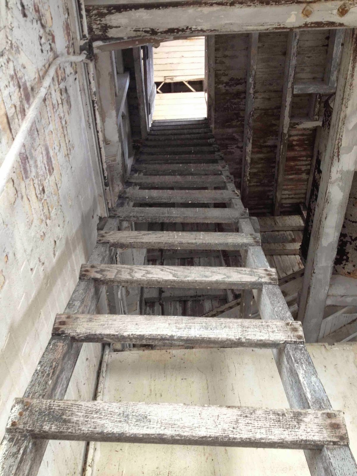
I had to walk up this rickety old ladder to get to a crow's nest lookout at the top--about 25 feet up. Birds have pretty much overtaken this old abandoned house, which is now owned by the state of New York.

Here's a view from the bow of our small fishing boat. The lake was as smooth as glass.


Ah, the abandoned lighthouse. Don't tell anyone, but I was doing research for a new screenplay and getting a little inspiration on our tour. In my story, this lighthouse is a dark, sinister place. But in real life, it's pretty cool.

Another angle. Yup, this is wild and overgrown. This truly is like a deserted island.

We also got to spend time at the home of my sister Christa in Lansing, NY. She and her husband Todd built an awesome timber-frame/straw bale house on 20 acres. Here, Zjena was helping to pick some super-sweet cherry tomatoes out of the raised beds you can see in the background. Later, we took a stroll to a multi-acre garden at Christa's in-laws' farm—which conveniently is located just a stroll away through the woods. There, we picked some incredible produce for lunch. With land like this, who needs grocery stores!

These raised beds with herbs were just so pretty. Pesto, anyone? Chris freezes so much pesto that it lasts through the entire winter. 

Rainbow chard.

Kale.

Zjena with her cousins, Juneau and Acadia--both named after some incredibly beautiful places in the world. They are holding some baby toads in their hands. We found them on this walk from my sister's house to the garden. Of course, we later let our amphibious friends go.

Check out this garden. Cucumbers, tomatoes, corn, pumpkins, squash, eggplant, Christmas trees...should I go on? You can see a greenhouse just peeking out at the upper right corner.

Eggplant from the greenhouse. So pretty.

Here's one of our amazing lunches by the lake: a Thai-inspired coconut corn soup with lime, cilantro and lots of basil. Most of the veggies and herbs supplied by Chris' family farm. Yum.

These plump uber-sweet raspberries were growing along the driveway. Wish I could grow these in Los Angeles, but I've never had much luck with raspberries. 


We took our boat to a place on the Lake known as the "High Rocks." The kids had a ball jumping off them.

Another shot from the crow's nest on the island. Looks like a framed piece of art.

Here's our ship's captain.