Monday, October 22, 2012

An Authentic Haunted House and a Furniture Store With Prices That Are So Low They're Scary!

A few cobwebs on our already scary interior and voila—we have the ideal backdrop for a good old fashioned Halloween party. Here's my son Max. He loves the decorations, but not getting caught in the webs.
Halloween is one of my family's favorite holidays. And we were all a little bummed this year because our home renovation was cramping our usual front-of-the-house decoration style. For years, we had a spectacular haunted porch. But, well, there is no porch anymore! Onward and upward—we've adopted a new attitude: Make the most of what we've got. And what we realized is that we have an even more spectacular canvas for Halloween this year. After all, our house has got to be the scariest house on the block right now and that's without a single decoration. So, we've taken full advantage of our natural spookiness. Those mounds of dirt in our front yard—still sitting there from digging out the new foundation—have instantly become dead bodies freshly buried. That metal sheeting on the exterior of the house, the stuff that holds the pre-stucco scratch coat? We've tucked a whole bunch of baby bats in there. And, then, of course, there's the inside of the house. An old chandelier waiting to be hung was ripe with spider web possibilities. A fireplace with barren studs behind it. Can you say perfect backdrop for a Halloween party?
Here's a close up of some our old Halloween friends from years past: Jack-o-lantern and Ghostie. They really have a great attitude. 


We covered our sofa with old sheets to spook it up. And then, let a witch sleep overnight on it. Max is not a fan of our  witch squatter though. Moments after this photo was snapped—and he  mustered his baby courage—he snuck up and stole his favorite walking stick out of her bony and posable grasp. 

The Halloween season would not be complete without a trip to a furniture store—well, at least one that has prices that are so low they are scary! We're not even close to buying furniture, but a girl can dream, right? This is Larry St. John Furniture, a secret little find in an Industrial park of Gardena. If you weren't looking for this place, you'd never find it. But, they have some great furniture. If you like Pottery Barn or Restoration Hardware, but don't like the prices—you will love this store. 


We gather that Larry really loves Halloween because a trip to his store was more like walking through a haunted house with some nice furniture thrown in the mix. Here, Jaws greets you at the entrance, so you already get a taste for some of the quirkiness yet to come. The man sitting at the front desk, for example, is a mannequin. My six year old grabbed my hand tightly at this point.

Larry also happened to have a Pirate Village on display with dead body parts splayed out. Who knew this was waiting inside? My six year old would not venture within 15 feet of this display. Just through the walkway here is the "Pirate Village," which was actually pretty darn scary. Thank you, Larry,  for giving my imagination some new fodder for nightmarish dreamscapes. As if I needed help in this area!

Here's the inside of the Pirate Village. The blonde hair in the lower left corner is not actually a human head, but a monkey head. And there's nothing scarier than monkey paws or heads, especially when they are disconnected from their bodies! 

Ah, back to some normalcy. This beautiful settee in Glynn linen #111.  My husband says our dogs would destroy it on the first day, but it is slip covered.

Look at the lovely arms and white piping. And the color blue of the slipcover is so dusty, it's delicious.

Here is a nine drawer dresser in 995 pine/birch wood with a Sahara stain and #56 knobs. I've got my eye on this one for our bedroom. It will go on the partial wall directly opposite our bed alcove.  Tons of storage and space to fit a flat screen TV just above it. 

But then, I saw this Huntington dresser. It's got only eight drawers, but it was about $300 less. The frugal side of me is keeping this option open. Is one drawer worth $300? It's likely the reclaimed finish of the nine-drawer dresser that ups its price though.

I am loving this French sofa with rolled arms. It's almost three and a half feet deep, but it looks as comfy as cotton candy wrapped in a cloud of soft, puffy goodness. The little pale blue pillow is exquisite. I already flashed to the future: seeing myself laying here while watching Brides Maids (again) in our new den/guest bedroom. Someone pinch me, I am dreaming. If I were a guest in my house, I would not mind sleeping on this. Would you?

A cute leather club chair. This one will not break the bank because it's made with something called "bonded leather." It's about one-half the cost of real leather.  Bonded leather is leather, but it's made from remnants--such as what's left over after making coats. They somehow run these remnants together and add a polyurethane coating, which makes this chair super tough and maybe a little shiny. Just what we need to stand up to kids and two dogs, who like to sneak onto the furniture when we're not home. I will take two of these, please!

I'm just digging the color of this rustic reclaimed pine cabinet and the blue-gray shutters behind it. It's inspiring the entire color palette for my living room and kitchen.

I could fit half of this cabinet in my great-room dining room area. It has the similar white-washed reclaimed look to it as the pine cabinet above. 

Because we'll have a lot of rectangular shaped furniture in our great room/living room, namely a seven foot long kitchen island, we'll have to go with a round table--so this one's out.
But I do like the zinc countertop shown here. And I love the white washed base. I may try to add a zinc countertop and this same white-washed finish to our kitchen island.

Here's a closer look at that finish. Do I have to hire a faux finisher to do this or could I figure out how to create this same effect? I'll have to do some homework and I'll report back.

Here's a close up of the zinc table top. I love this industrial look, because it will create a nice juxtaposition to the rustic and more feminine elements in my great room space. I even like these nail heads. Zinc has the added benefit that it's naturally anti-microbial and its patina just gets more interesting with time. I asked a clerk at the furniture store if they could put a zinc top on my kitchen island and they said they could not. And he warned against doing the job myself because I won't have the ability to press the zinc down as they do in the metal shops. We'll start researching for a metal shop that can do this for us on a budget. I'll report back with our finds.

Here's my daughter  and super decor assistant Zjena holding my clipboard. Notice the sketch of the settee on the paper. Larry St. John's Furniture makes shopping easy by providing plenty of clipboards, paper, pens and even measuring tapes for customers. Smart! These days, I don't leave the house without a measuring tape in my purse. Sometimes I have two. But, it's good to know I had a backup.

Here is my husband holding baby Max—they are very relaxed in this photo. They gave this couch a 9.9 in terms of comfort and ease of use. They almost fell asleep while Zjena and I finished our shopping. If you want more info on this great furniture store, here's the link: www.larrystjohn.com. Or visit them in person at 18101 South Figeroa St., Gardena, CA 90248. 

Monday, October 1, 2012

My Malibu Dream House: My Inspiration

In addition to being a Craig's list fan, I also enjoy Realtor.com. I plug in a zip code for an area that I like and cruise around imagining myself living in various properties. I usually cruise low to high in the price range, and then, happily keep upping my budget. Well, what would a million get me? When you plug in Malibu, CA as your search location, it's not hard to start meandering into the multi-million-dollar house price zone. And that's where I happened upon this little gem on PCH, which was recently sold for about $7 million (it's right on the beach). I kept all of the images on my desktop because I loved the French style of this house and planned to use it as a model. There are some great details here, including the stained arched doors, flag stone patio and salmon-toned stucco. But what I really love is the barrel roof tile treatment. Looks like the edge treatment is about three layers thick. The funny thing about this house is that a few weeks after noticing it on Realtor.com, I kept seeing it pop up in various places. The first time was while visiting ROC design (http://www.rocdesigninc.com/home.html), owned by architectural designer and general contractor Dominique Rocoffort de Vinniere. Dominique's office is right by my house—across from our Whole Foods Market—and my husband and I can't resist stopping in there from time to time to look at the beautiful windows, doors and shutters on display in his showroom. We purchased some African mahogany French doors and rustic closet doors that had been sitting in his office for a year at least (and were nicely discounted.) On this trip, Dominique was graciously showing us some of his design work via his computer and voila—one of his pics was the same one from Realtor.com. Turns out, he designed my Malibu dream house. He also revealed the secret of how to create the three-layer thick clay tile edging. Apparently, in France, the wealth of an owner was represented in how many rows thick the roof tiles were layered. I don't need to be quite so ostentatious in my roof design, but I do love the look of several rows! We're working on our roof now—so here are a few pics to give you an update of how far we've come. You may notice some similarity to the dream house, but it's subtle.
Here's the Malibu Dream House. I happened upon it at Realtor.com and fell in love. Right on the beach, it recently sold for $7 million. 

Ah, do you see a little bit of the dream house vision here? You may have to squint. In this pic, we hadn't yet started the roof yet. Nor, put up the black builder's paper.

Here's a closer look at where the two parts of the house meet at the roof. I was seeing a little bit of similarity to the Dream House with this joining.

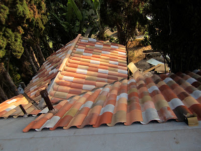
Here, the tiles are starting to be placed on the roof line. Notice the clay pieces at the end of each tile. They're called bird stops. The clay S tiles, which are made by Boral/U.S. Tile, are pretty eco-friendly. They are cool-roof rated, 100% recyclable and are made from 59% recyclable materials. We went with Corona del oro and merlot, but we've been adding a "slurry" of cement mixed with stucco pigment to get some of the sage, white and gray tones mixed in with the terra cotta and merlot tones. I've noticed a nice patina to Provence-style roofs, so we had to create ours from scratch. (Notice the Malibu Dream House has tiles that are likely reclaimed barrel tiles shipped from France. They have a stronger arched barrel shape than the "S" tile.) Our unconventional roof tile color selection has not gone unnoticed from our neighbors, who have called it "colorful."  I think that's a good thing. But, not sure yet.

More of the tiles going up.

A view from the roof looking down toward the street. Yes, it is colorful. We think after the first rain, some of the pigment will wash off, so we're not exactly sure what how the final patina will look.

This is a close up of the ridge prior to the ridge tiles going on. The cement is terra cotta colored, but gets lighter when it dries. The metal gully there is where the rain should drain out. I had no idea how complex this process was until watching our crew go to work. It's especially tricky to place the tiles around the sky lites, of which we have nine. If it's not done properly, your sky lites will leak.

This view just shows the west side of the roof still to be finished. The shingled roof shown in the background is the garage. It will have to be covered in tile as well.
The other place I happened upon "My Malibu Dream House" was on one of my favorite blogs called "Velvet and Linen" by Brooke Gianetti. It was one of her posts in which she was showing the interior decorating work of Ann Barron. The best part: Brooke showed some great close-up shots of the inside of the renovated malibu beach house that I originally saw on realtor.com. It's tres beautiful! If you want to check out more pics, click here: http://brookegiannetti.typepad.com/velvet_and_linen/2011/06/a-giannetti-home-project.html?cid=6a00e554d7b827883301538f376885970b