Thursday, March 7, 2013

Library Loft Takes Shape

Behind these doors is our old sun room. While a sweet little extra (just off the dining room) in our house with giant windows on the southern and western walls, this room always had issues. Single-paned, un-openable (with some cracked) windows and no insulation meant the temperatures inside could easily reach 120 degrees F in the summer! And get pretty darn cold in the winter. My husband, who used this space as an office, was the only one brave enough to take it on—hence, we usually kept these white folding doors closed at all times. The previous owners had covered this sunroom in dark paneling and thick heavy drapes, which we quickly ripped out and covered in white paint when we first moved in. But I always felt this room had incredible potential that we never fully realized. When our feng shui consultant came to our house, we were aghast to discover that this sad space was housing the "wealth" center of our home. Yikes! Good thing we've finally undertaken it's renovation. 
Here's a view of the sun room from the outside when we started this whole-house reno. If you want to see something scary, just take a close inspection of this space. Woah. When our crew dismantled it, we discovered there was really no foundation. That explains the big crack down the south side. Our reno addressed all of these issues, including digging out and pouring a new foundation. I have to say this was one of those discoveries you hope not to find when you're on a budget. But, we are glad to have fixed it.


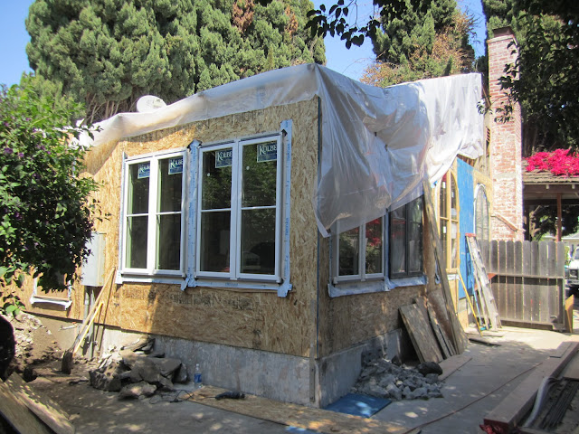
Here's a view of the new Kolbe windows installed. They are dual-glazed and very energy efficient. We had to match the ones we bought on Craig's List. They are also French-style casements, so they will open out, allowing fresh air to flow into our sun room!

Here's a view of the plywood installed. Still waiting for a new roof though! 

In case you were curious what the sun room looked like with its south wall removed. 

Here's a view from inside the old dining room. Remember those white doors from the first pic. They are gone.

I had to include this photo, too. It demonstrates the extent of this remodel, which has been pretty major. That entire roof was removed board by board and replaced. That's a lot of work.

Here's a view from the old sun room looking into the old dining room. I wish I could blame those diamonds on a previous home owner, but I take full responsibility. When we knew we were going to renovate this house, I decided to get a little crazy with the colors because I knew we wouldn't have to live with them that long. We had a lot of fun in that crazy dining room!
I'm fast-forwarding here. Quite a jump in progress. You can see our entirely new roof peaking out the top here. The new roof actually changed its pitch a little bit more sharply--but it evened out the roof above the sunroom, which was always a little off from the rest of the house. That old piece of wood seen above our windows is a "cosmetic" lintel I asked our crew to add on. Since it's actually part of our old roof, I consider it an homage to our old house. Yet, it adds a bit of character, unifying these two windows. This wall was eventually clad entirely in stone, which gave this lintel a more rustic, but realistic appearance. Looks like it's been there for a 100 years.

Now we're getting to my inspiration photos. Our new sun room has to work double, maybe triple-duty: not only as a sometimes office and family room, where we all hang out and watch movies. But, it also has to be a place where guests can sleep. The room shown here demonstrates a super-efficient use of space when it comes to sleeping quarters and storage.

Another great inspiration photo. Love the muted colors here. And the drawers for storage under each bed. And how about those curtains? Those curtains turn this one room into four private bedrooms. You could host some serious PJ parties here.

Another great use of space. These beds are just tucked right in and out of the way. Again, with curtains.

I'm loving the color palette in this room. And these built-in couches look incredibly easy to make and very comfy. The concept we have for our new sun room is really a library loft. Where books and a bed will be up above, accessed by a kid-friendly ladder. And down below, will be a built-in couch with a huge storage bin beneath it. I already have this space ear-marked for our 1-year-old's toys, which have now taken over the guest house in which we're living. The area opposite the built in couch and loft-bed will be the flat-screen TV and desk, hence, the family room/office/guest bedroom combo.

For anyone who likes books (and I do!), this is a great use of wall space. Go vertical. There is often a lot of vertical space that can be utilized when cool little shelves are added. And hello: more built-in couches. If there is storage under those cushions, this room really rocks!

Ah, back to reality: our space. You can sort of see the loft bed going up. Because our sun room is sunken, the loft bed is about eight feet off the ground, so you don't feel as if you're under a tightly fitted bunk bed. There's quite a bit of space and nothing blocks the window light. Unfortunately, it wasn't a great time to take this photo--hence, some dark shadows.

Here's a better view from on top of the loft bed. Imagine a nice white futon mattress that's about 10 feet long, which is the length of this loft. And lots of pillows. In the vertical space will go lots of books. Our electrician just installed the reading light sconce, which will go on the north wall. I already imagine my 6-year old doing her homework up here. And me reading the book that comes after Game of Thrones in the incredible Song of Fire and Ice series by George R. Martin.

Here, you can see the structure for the built-in couch below the loft bed taking shape. There will be a ton of storage under the couch cushions. We also had an outlet installed on the outside of the couch so that we can plug in those lap tops. This room should be a great work space for everyone in our family.

In closing, I couldn't resist adding this photo. Here's a view from the loft bed looking toward the north wall. We added a square window that looks out into the kitchen. It lines up with the round window of the kitchen that connects to the kid's bathroom. (Don't worry, it's obscure and about 11 feet above the floor.) It's just a cool little view through the house, a little secret view for anyone who dares to climb the ladder to the library loft bed. And it hopefully brings light back and forth between the spaces, depending on the time of day and position of the sun. You can also see a little bit of the brick arch we added to the right. More pics to come of this 9-foot doorway, which replaces those white doors you saw at the very beginning of this post. We have nine-foot arched oak french doors just waiting to be hung on barn door hardware (due to arrive next week). Those doors were another $100 Craig's list find in Ojai, Calif. Yup, we traveled all that way for a couple of awesome doors. We carried them back on the roof of our Jeep Wrangler. People who saw us probably thought we were carrying a couple of surf boards! Extremely heavy surf boards! Quite an adventure, that day.

No comments:

Post a Comment