Tuesday, March 12, 2013

Getting Fired Up About Our New Fireplace!

We renovated our fireplace two weeks ago (pic to come below), so I thought it fitting to chronicle how far we've come. This shot is of the old fireplace, a very traditional style wood box fireplace with brick trim. It doesn't look too shabby. I did paint those walls turquoise and loved them. People who came to our house called it  "the happy house" because these walls sure were upbeat. I was thinking we might keep this fireplace in tact after all even though it didn't fit with my new Provence or Tuscan theme. But, we had a little glitch that happened early on...

Here's what happened: We added these giant five foot arched wood casement windows on each side of the fireplace. The window on the right had to be moved over to accommodate a structural beam, which meant the fireplace box was no longer symmetrically positioned between the windows. Ah, one of the many retrofitting challenges of renovating a house rather than building one from scratch. 

Here's another view of those arched windows. Messy yes. But this shot reveals how different a room looks and feels when you take out the ceiling and three walls. It opens it all up. 

Here's a shot of the fireplace with the traditional wooden box removed. Somehow we knew we'd have to even this all out to make the fireplace symmetrical to the new windows.

So, we reshaped the new fire box by moving the entire thing over and adding new brick inside.

Another in process shot.

It's not final yet, but you can see the new fireplace taking shape. We had just a tiny bit of the reclaimed french pavers left, so we covered up the old brick with the last few pieces so that this hearth will tie into our kitchen floor, making the two spaces more cohesive. When we finish this great room floor with polished concrete, it will be flush with the hearth. We contemplated putting a nice chunky piece of wood on top of this fireplace for the mantle, but I think we like the clean, modern lines of this one. It will be one of those features that give this house a modern "twist." We'll add smooth white plaster over this and lime wash on the inside so you won't notice the disparate sizes of brick. I imagine an eight foot organic driftwood piece of art above this mantle and already have my eye on one. I'm thinking it will help to keep this fireplace as the focal point of the new giant room, yet also draw your eye up toward the ceiling. There are track lights installed on the ceiling, so I imagine it would create a nice play of light on all of those interesting wood crags and grains, especially at night. We'll see. Mirrors are also nice!
 

A close up of the french paver hearth. This will clearly establish the color palette for this room.

Just another view that mirrors the first photo in this post. Wow. It's a little scary at this point. Hope we did the right thing!

Here's a nice inspiration photo, which I found on one of my favorite blogs: Velvet & Linen by Brooke Giannetti. This modern plastered fireplace is from a a home called "Arrighi" as seen at Italianvillas.com. I do love the feeling of this clean, modern space juxtaposed with the rustic wood beams. 

Here's another room from the same villa. Another clean plastered fireplace. The combo of the clean plaster and the warm wood tones is so soothing. It's a look that just doesn't feel like it would ever go out of style.

This post wouldn't be complete without a nod to the traditional French limestone fireplace with its lovely curvy lines and substantial vertical size. Now, this is a focal point in a room. No doubt about that. What do you think? When it comes to fireplaces, are you more modern or traditional? And why?

Thursday, March 7, 2013

Library Loft Takes Shape

Behind these doors is our old sun room. While a sweet little extra (just off the dining room) in our house with giant windows on the southern and western walls, this room always had issues. Single-paned, un-openable (with some cracked) windows and no insulation meant the temperatures inside could easily reach 120 degrees F in the summer! And get pretty darn cold in the winter. My husband, who used this space as an office, was the only one brave enough to take it on—hence, we usually kept these white folding doors closed at all times. The previous owners had covered this sunroom in dark paneling and thick heavy drapes, which we quickly ripped out and covered in white paint when we first moved in. But I always felt this room had incredible potential that we never fully realized. When our feng shui consultant came to our house, we were aghast to discover that this sad space was housing the "wealth" center of our home. Yikes! Good thing we've finally undertaken it's renovation. 
Here's a view of the sun room from the outside when we started this whole-house reno. If you want to see something scary, just take a close inspection of this space. Woah. When our crew dismantled it, we discovered there was really no foundation. That explains the big crack down the south side. Our reno addressed all of these issues, including digging out and pouring a new foundation. I have to say this was one of those discoveries you hope not to find when you're on a budget. But, we are glad to have fixed it.


Here's a view of the new Kolbe windows installed. They are dual-glazed and very energy efficient. We had to match the ones we bought on Craig's List. They are also French-style casements, so they will open out, allowing fresh air to flow into our sun room!

Here's a view of the plywood installed. Still waiting for a new roof though! 

In case you were curious what the sun room looked like with its south wall removed. 

Here's a view from inside the old dining room. Remember those white doors from the first pic. They are gone.

I had to include this photo, too. It demonstrates the extent of this remodel, which has been pretty major. That entire roof was removed board by board and replaced. That's a lot of work.

Here's a view from the old sun room looking into the old dining room. I wish I could blame those diamonds on a previous home owner, but I take full responsibility. When we knew we were going to renovate this house, I decided to get a little crazy with the colors because I knew we wouldn't have to live with them that long. We had a lot of fun in that crazy dining room!
I'm fast-forwarding here. Quite a jump in progress. You can see our entirely new roof peaking out the top here. The new roof actually changed its pitch a little bit more sharply--but it evened out the roof above the sunroom, which was always a little off from the rest of the house. That old piece of wood seen above our windows is a "cosmetic" lintel I asked our crew to add on. Since it's actually part of our old roof, I consider it an homage to our old house. Yet, it adds a bit of character, unifying these two windows. This wall was eventually clad entirely in stone, which gave this lintel a more rustic, but realistic appearance. Looks like it's been there for a 100 years.

Now we're getting to my inspiration photos. Our new sun room has to work double, maybe triple-duty: not only as a sometimes office and family room, where we all hang out and watch movies. But, it also has to be a place where guests can sleep. The room shown here demonstrates a super-efficient use of space when it comes to sleeping quarters and storage.

Another great inspiration photo. Love the muted colors here. And the drawers for storage under each bed. And how about those curtains? Those curtains turn this one room into four private bedrooms. You could host some serious PJ parties here.

Another great use of space. These beds are just tucked right in and out of the way. Again, with curtains.

I'm loving the color palette in this room. And these built-in couches look incredibly easy to make and very comfy. The concept we have for our new sun room is really a library loft. Where books and a bed will be up above, accessed by a kid-friendly ladder. And down below, will be a built-in couch with a huge storage bin beneath it. I already have this space ear-marked for our 1-year-old's toys, which have now taken over the guest house in which we're living. The area opposite the built in couch and loft-bed will be the flat-screen TV and desk, hence, the family room/office/guest bedroom combo.

For anyone who likes books (and I do!), this is a great use of wall space. Go vertical. There is often a lot of vertical space that can be utilized when cool little shelves are added. And hello: more built-in couches. If there is storage under those cushions, this room really rocks!

Ah, back to reality: our space. You can sort of see the loft bed going up. Because our sun room is sunken, the loft bed is about eight feet off the ground, so you don't feel as if you're under a tightly fitted bunk bed. There's quite a bit of space and nothing blocks the window light. Unfortunately, it wasn't a great time to take this photo--hence, some dark shadows.

Here's a better view from on top of the loft bed. Imagine a nice white futon mattress that's about 10 feet long, which is the length of this loft. And lots of pillows. In the vertical space will go lots of books. Our electrician just installed the reading light sconce, which will go on the north wall. I already imagine my 6-year old doing her homework up here. And me reading the book that comes after Game of Thrones in the incredible Song of Fire and Ice series by George R. Martin.

Here, you can see the structure for the built-in couch below the loft bed taking shape. There will be a ton of storage under the couch cushions. We also had an outlet installed on the outside of the couch so that we can plug in those lap tops. This room should be a great work space for everyone in our family.

In closing, I couldn't resist adding this photo. Here's a view from the loft bed looking toward the north wall. We added a square window that looks out into the kitchen. It lines up with the round window of the kitchen that connects to the kid's bathroom. (Don't worry, it's obscure and about 11 feet above the floor.) It's just a cool little view through the house, a little secret view for anyone who dares to climb the ladder to the library loft bed. And it hopefully brings light back and forth between the spaces, depending on the time of day and position of the sun. You can also see a little bit of the brick arch we added to the right. More pics to come of this 9-foot doorway, which replaces those white doors you saw at the very beginning of this post. We have nine-foot arched oak french doors just waiting to be hung on barn door hardware (due to arrive next week). Those doors were another $100 Craig's list find in Ojai, Calif. Yup, we traveled all that way for a couple of awesome doors. We carried them back on the roof of our Jeep Wrangler. People who saw us probably thought we were carrying a couple of surf boards! Extremely heavy surf boards! Quite an adventure, that day.

Wednesday, January 30, 2013

The Kids' Bathroom: Inspiration Takes Shape


Here's a look at the closet from my daughter's old bedroom. We added that window and then, ripped out everything else. This space will basically be converted into the new water closet. We extended the house behind those shelves--and that's where the shower/tub area will be. To the left of this closet was the old laundry area. This has become the new kid's bathroom. We had planned to create a new floor out of polished concrete, but as luck would have it, we had some extra terra cotta pavers left over from the kitchen and sunroom tiling. We even eked out a few more for the water closet. It's a more grownup look for a kids' bathroom, but we'll keep the elements organic with white plaster and rustic, earthy materials, which also means indestructible. With our swimming pool, we tend to have a lot of play dates at our house and that means a lot of wet towels, feet and bathing suits. So, our kids' bathroom has to be tough. In fact, our backyard pool and jacuzzi played a large part in how we designed this bathroom. It's right off the back steps to allow traffic straight from the jacuzzi to the bathroom (and vice versa). We also needed ample space for this bathroom because it's essentially a bathroom inside of a bathroom and will be used by multiple kids at one time. So for us, the toilet area had to be private so that the rest of the bathroom could be used or left open as a thoroughfare to the rest of the house. The shower/concrete bath tub area, which has a partial wall, is also private with hooks inside for a robe. We also opted for a towel warmer because we use our jacuzzi year-round and a warm towel is the only way to muster the courage to get out of the jacuzzi on cold winter nights!

The Inspiration

In order to finalize our design for the kids' bathroom, I looked at quite a few bathroom images on line. Here are a few pics from my inspiration file. I found that I kept returning to earthy clean bathrooms with elements of concrete, stone, wood and plaster. 
I love the look of the wood vanity here with the porcelain vessel sink. So pretty. Vessel sinks do have their drawbacks though. Not as easy to clean as the undermount sinks. And they seem to take up more counter space.
This is a great bathroom. Again, a nice combo of vessel sinks with a wooden vanity that looks to be a refurbished table. This gave me the idea to split our farmhouse table in half and use it as our vanity. (The other half will become the desk top for my daughter's new room.) I would have loved to keep this farmhouse table for our dining room, but it's long and rectangular and would compete with the wood island of the same size. Too much bulky furniture filling up our open floor plan.
Another nice wooden vanity. This time with a rectangular sink. I also like the wall mounted fixtures.
Wow. This vanity looks like art. Beautiful. But, doesn't look like kids live here.

This is one of my all-time favorite bathrooms. Those concrete floors look super tough and easy to clean. I also love the stone wall and towel warmer.


Here is another great example of what you can do with concrete. Love this bath tub and the vanity with the sinks dropped right in. 

I love the French doors here and another partial wall partitioning the shower area.  Very clean.

Love the juxtaposition of the concrete with the crystal. We'll have a chandelier in the kids' bathroom, too. Maybe a little grownup for our kids--but I have to have it.

This is where I got the idea to do pavers in the bathroom. I love the rustic look of this bathroom. And the built-in closet made with a reclaimed door looks great. Don't think we have room for that chaise lounge though. Too bad.

Another beautiful bathroom with a sink that's so sculptural. I wouldn't mind this as my master bathroom, but it doesn't have a kid-friendly vibe at all.

The image to the right looks so bright and light. Nice concrete countertop. And again, terra cotta tile floor. This is a vacation home in France that is available for rent. I guess I just love the feeling of being on vacation and that is just what this bathroom evokes for me.

Again, clean, modern. Nice built in cabinetry. How easy would it be to make that vanity from concrete with a shelf below for bath essentials and/or towels? That ladder makes a stylish towel rack.

I love this bathroom. It just feels like you're on vacation in France in this bathroom. Rustic, yet functional. Are those waste baskets down below? Or laundry baskets? Not sure, but I love those, too.


Here's a view of my daughter's old bedroom. Her door entered into the old kitchen/service porch/laundry area, which was not that practical and pretty cramped.  We blew out that back door and extended the back of the house to accommodate our bigger bathroom. We also added pocket French doors to lead into the new bathroom from what will now be my son's bedroom.

Now, you can see the walls removed and the new pocket doors that will lead into the kids' new bathroom. There are French doors just beyond these that lead to the backyard and a stone walkway leading to the pool and jacuzzi. The area just inside these pocket doors and to the right is the new water closet. Behind that is the shower/tub area. Inside these doors and to the left is the dual sink vanity area.

This is a view of the new shower/tub area. There's that partial wall. We also added a nice tall beam reclaimed from the old attic of our house. 

This is a view of the old closet now framed into the water closet. We're missing a ceiling here, too. That has been added, of course. And this room is now tiled with the pavers.

Here's a sketch of the south wall of the kids' bathroom. That's our old dining room table split down the middle. I just ordered those rectangular sinks from overstock.com. And that round window at the top is reclaimed from the front of our house. It wasn't to code for use in an exterior wall, but it works nicely here on this interior wall, which is shared with the new kitchen. It only lets light through. You can't actually see through it. The chandelier will hang centered to this round window, so you may be able to see the glow when you're in the kitchen.

Another overstock.com purchase. I love the dual flush system and modern design. It should be easy to clean around the base of this toilet. 

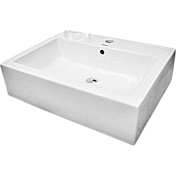
Very budget-friendly rectangular sinks. I did find a cool trough sink on Craig's list, but it was still more expensive than two of these ceramic sinks on overstock.com.

We chose this faucet because it's nice and modern and doesn't require you use two hands to adjust your water temperature. Should be easier for the kids. The spout height also seemed to work perfectly with the sinks we selected. We could have gone with a faucet that was mounted behind the vessel, but we were afraid we'd have too much water splashing behind the sink all the time.

A hard-wired towel warmer. This will go on the partial shower wall. I know we could have lived without this--it was a budget-friendly splurge. But, I will make good use of this.

Stay tuned. I'll post pics soon as the bathroom pieces are installed. The plumber is putting in sewage pipes this week. And the toilet just arrived today!